Friday, 23 April 2010
Audience Feedback
Samantha Milne (Aged 15)
Positive: Ending –When the screen blurs and title come up was praised
Negative: The intitial close up of the couple was too long. I agree with this point and was one of the things I had found wrong with it and wanted too change however Josh at the time had already started to upload it to Youtube so it was too late.
Lauren Farmer (Aged 16)
Positive: Praised the music
Negative: Thought the ending carried suspense- not sure why this was negative?
Henna Mistry (Aged 16)
Positive: Again praised the music, she thought it was very good and set the mood
Louise Pearson (Aged 17)
Positive: She really liked the dark atmosphere created through the mixture of black and white scenes and the music playing. She also liked the contrast between the action shots and the pans across the photos because it added more depth story and opening; she said it looked more like an obsession with the photos being used.
Negative: She said: 'In one of the shots cutting from Sophie and Tom, to Josh through the camera, Sophie changes position from cuddling Tom to looking at the camera, then back in the next shot. This disrupts the flow of the action because it's a little distracting. Also, in the last shot, it isn't totally clear Josh is running towards the 'couple' as the first few times I thought he was running away from them'
Laura Knighton (Aged 17)
Positive: She praised the music saying it 'was awesome', she also said 'the effects were very atmospheric and the end kept me in suspense '
Negative: She found some of the walking around a little repetitive
Monday, 19 April 2010
Evaluation- Final Part
Another thing I learnt was to film scenes from multiple angles to make it more interesting than one long take which can get boring and not engage an audience. Although I think my preliminary task video does use various different angles the main task displays a much improved skill of including a wide range of angles and shot types. In addition, I have learnt how to ensure continuity consistently throughout the main task. In the preliminary task there is a moment where a person is going to sit down while addressing some one who is already sat down, that person is talking and there head is in motion. The camera then jumps and they are still taking a few seconds to carry on speaking. This looks unnatural and breaks the flow of action. In the main task however there are moments which the camera cuts successfully between angles and continuity is not broken, for example when the couple are walking and the boy turns his head in one shot and returns in the next. Finally I have learnt much more about the editing software Adobe Premier Pro. In the preliminary task I only cut shots down and placed them next to each other on the timeline but in the main task I learnt to include text, music and various effects to enhance the product. Below is the preliminary task video and above is the final edit for our Thriller, this should demonstrate an improvement in filmmaking, with the Thriller being more complex and focussed.
Evaluation- Part Five
I have learnt a variety of techniques throughout this project. First of all I learnt about aspects of the camera which we would use for filming. I learnt of the 180 degree rule in which once you have placed the camera down you can only film in a certain space whilst in the same scene to avoid the audience having to go through confusion and disorientation. However this was not really a priority to remember whilst filming shots for our opening as there were no typical conversations or shot/reverse shot moments where the 180 degree rule can easily be broken. I learnt how to set the camera to widescreen- the format we were required to film in and the white balance and how to set it, gaining the knowledge that if I didn't then the colour would appear to bright, dark or mismatched. I learnt that whilst filming you must always be careful and not rush, making sure to check everything about the camera is how you want it. The group learnt this lesson due to two of our scenes not being filmed in widescreen due to us forgetting to change the settings, meaning we had to re-film them.
The most important thing that I have learnt and put into practice is the skill of filming scenes using different shot types and angles that can later be edited together to make a particular scene more interesting as you see it from different angles and perspectives. It also breaks up the action more which puts an end to long takes from one angle which can become boring. For example the first scene of a victim walking is broken up between a long shot from a side view, a front view shot and a rear shot as he walks. Below are stills from our opening providing examples of the various shot types and angles we have used:
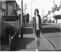
This front view long shot allows you to see the identity of the character, all of their body and the action they are performing and allows you to see the location.
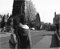
This rear shot allows you to see where the character is headed and the location they see.

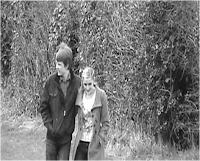
This front view mid- shot allows you to see the character's location and that they are walking but allows more detail of their faces, this is needed to establish their happiness and their innocence and lack of awareness of what is to come.
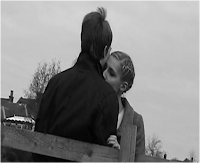
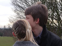
This close up allows us to see more detail of the characters and represent their closeness as a couple. It also allows us to see a change in mood as the girl starts to notice something in the bushes. A close up allows the audience to realise she has seen something, from a long shot they would not be able to tell.
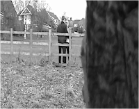
This long shot is from the point of view of the killer. It reveals that someone is watching them and builds up tension, especially when the scene keeps alternating between this shot and the close up shown above.
I also learnt that you can use shots to create meaning or representations. For example we used a high angle shot to make a victim seem vulnerable as they are watched by the killer, unfortunately this scene was cut from our opening. The still below illustrates when we filmed from this angle to create representation.

Another important skill I learnt was how to put the different shot types and angles together in a sequence using the editing software Adobe Premier Pro. I learnt that you had to go through the process of cutting the shot down using the cut tool, and then placing it on the timeline next to the previous shot. I learnt that consistency and continuity are important to maintain throughout the opening. Below are examples from the editing process where I put what I had learnt about cutting, editing shots together and continuity into practice.
- We filmed a scene of a couple walking through a park field from several shots and angles. The first shot of the couple is a front view as they walk towards the camera. We then edited the footage to cut to a long shot from a side angle by placing it next to the previous shot on the timeline. In this shot the boy who I play turns to look to the side, this is where we decided to cut back to the front view. We edited this so the front view shot appears again when I return my head from looking. This creates a flowing scene where the different angles match together, again ensuring continuity.
- For the end of our opening there is a close up of the couple hugging against a fence. We edited this so the camera cuts between both sides of the couple alternating between seeing the boy's face and the back of the girl and vice versa with a long shot from the viewpoint of the killer as the girl starts to notice something. This creates tension which builds up to the climax which is where we placed the shot of where the camera drops and you see the killer run towards the couple.
The camera alternates between these shots.
- We filmed Andrew walking down the street from a side viewpoint from the other side of the road, in front of him as he walked towards the camera and behind him as he walked away. We placed these three clips together on the timeline starting with the side viewpoint before cutting to the front view and then the rear view. We spent a lot of time cutting little sections away so they matched with each other, meaning the continuty was met. For example at the end of sideview shot Andrew walks past the end of a wall and as the camera then cuts to the front view he needs to be in the same position so we cut the clip so it started with Andrew next to the wall meaning it follwed on accurately.
I also learnt how to use various other aspects of Adobe Premier Pro such as inserting titles and music to enhance the opening. I also had a look at the various visual effects you could add such as transition types- we opted for a fade transition as it subtly moved between the scenes. I also learnt how to set up and maintain a blog, something I have never done before. I have enjoyed doing this as it is a different way of presenting your work and allows the insertion of pictures and clips and this makes a change from writing an essay. However I found that doing so can be very fiddly and time consuming. Overall, I have learnt a lot from the project and I am proud of how the group used different shots and angles and edited them together.
Evaluation- Part Four
In addition we have appealed to boys (and presumably some girls) in our teenage target audience by including creating tension and action early on through the use of fast cuts between the point of view of the killer and a close up of the girl looking at something in the trees. This will engage and interest the audience, keeping them on the edge of their seat very early on in the film, this is reinforced by the use of eerie music full of mystery that matches the action well, building up and suggesting something isn't right and something bad is going to happen.
The opening sequence of Quantum of Solace features a car chase, which although is on a much larger scale and is even more action packed (and the action and tension are different kinds to ours) it also uses this strategy to engage the audience early on, create tension and appeal to a young teenage boy audience who like lots of action.
Evaluation- Part Three
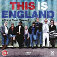
If Out of Focus was an actual feature length Thriller it could be distrubted by the Optimum Distribution Company (http://www.optimumreleasing.com/) because it is supported by aid from EM Media- a company specialising in generating business in the East Midlands for filmmakers by providing actors, equipment, props and locations to film with, within the East Midlands. This could be one possibility as we have created this opening in the East Midlands and if it were a real film we could use the support from EM Media (http://www.em-media.org.uk/) to create it, staying within our own location and it would generate business for the area- meeting the requirements of EM Media's agreement for support. However there films do not tend to be large scale action or suspenseful films but more culturally specific films with a niche audience such as 'This is England', illustrated below.

Therefore another distributor that I think would be suitable to distribute our Thriller were it a real film is New Line Cinema. (http://www.newline.com/) Research says: 'New Line Cinema was founded in 1967 and is one of the major American film studios along with 'Warner Brothers' and '20th Century Fox'. Although New Line Cinema was originally an independent film company, it became a subsidiary of Timer Warner 1996 and later merged with larger studio sister 'Warner Brothers' in 2008'
However, if it was distributed by a large company like this it may not be very popular due to no well known actors, locations or a big budget being present in it. Therefore our film would be more suitable to be distributed to local Broadway cinemas across the UK by a company like Optimum (with support from EM Media) rather than multi-plexes which have certain requirements (like the genre and stars) for a film to be accepted to be shown. Although Optimum and EM Media do not make films in the Thriller genre it could be their first attempt at targeting a new audience and market.
_poster.jpg)
There are several effective ways that our thriller could be marketed. As it is aimed at mature teenagers aged between 16 and 22 and more specifically boys, an effective way of marketing and promoting the film would be to use the internet as this is accessed by most people of these ages and is a large part of their lifestyle. A web- site could be created with trailers, interviews, sneak- peaks and news about the film and a link/ advertisement could be placed on social networking sites as well as film and game sites such as Empire and Gamespot, sites boys of this age are sure to visit. In addition Youtube would be another site to place trailers and clips from the film as this is visited by the majority of people who have access to the internet. This method of advertising the film would be successful as it uses a tool/ technology (the internet) that the target audience is regularly involved with, allowing news of the film to reach out to them. Further marketing methods that advertise through sources the target age are interested in that would be used are posters, television trailers and advertisements in magazines which boys of this age would buy such as game, film and 'lad' magazines. In addition they are 'whats new' services on game consoles like the Playstation 3 that could advertise the film too.



Another advertising method for our Thriller would take inspiration from Univeral's marketing strategy of Bridget Jones' Diary released in 2001. Universal used synergy with various companies to promote the film for their benefit and attract customers to the other company. Synergy benefits both companies and is a tool to gain audience interest and popularity in the film using the services or products of other companies. Universal made deals with the Body Shop, Diet Coke and Virgin Megatores to promote Bridget Jones. The companies selected and promotions used link to the narrative and characters of the film. For example Diet Coke uses 'diet' which links with the aspiration of Bridget to lose weight. Synergy is an effective way of capturing the audience's interest in the film. We could collaborate with companies which our target audience is interested in such as Sony and Apple. However it would be more tricky to promote our film this way as it is not aimed at a mass audience, nor doe sit have a plot that is easy to link products or promotions with. Therefore we could highlight the dangers of abduction of teenagers and promote awareness, this links to the narrative of the film and is a serious current affair.
Evaluation- Part Two


Evaluation- Part One
- Establishing a narrative- the scattered photos (illustrated below) hint to the audience that the people in them are being watched, the scenes of the people in the photos suggest they are targets/ victims being watched and followed. The ending establishes the fact that a killer is targeting teenagers.
- Generates audience interest- by setting up the narrative without giving too much away- only the idea of a killer and victims is known.
- Titles display the makers and stars of the film.
- Suitable music is used to enhance the sequence, establishing mood and atmosphere. In our opening the music is used to create a mysterious and tense atmosphere.
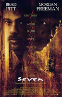
- The Opening sequence acts as a prologue and montage before the film starts properly, this is common in films as existing opening sequences use this style. For example 'Seven', which switches between short shots of different objects and the titles, hinting at the plot and elements in the story. Our opening is similar to this providing clips of past victims of the killer and was inspired by the style of this opening. Below is the opening sequence of Seven.
- No speech is used- a style used in many opening sequences and again another aspect of the opening of the Thriller 'Seven'.
Our opening sequence conforms to the codes and conventions of Thrillers by:
- Fitting into a sub- genre- which is crime/ action
- Establishes a story which would feature detectives trying to stop the killer rather than work out who they are. The identity would only remain hidden during the opening to generate intrigue and interest. This type of plot has the common structure often used in thrillers.
- Establishes a story which could occur on a grand scale (a convention of a Thriller)- mass- murderer, abductions and a grand investigation to stop the killer could all occur later in the film from the narrative that is set up here in our opening..
- Establishes a story which could include large and violent set- pieces- another convention of a thriller.
- Creates Engimas- such as the identity of the killer, the ideology behind the killer's actions and who the victims are and what happens to them
- Tension and suspense is created- through the use of a change in music that is much more tense, slow and signifies danger. The audience is kept on edge as the camera keeps cutting between a close up of the girl- Sophie looking into the trees and a point of view shot of the killer, whilst the music builds up to the climax of the killer dropping the camera and running towards the couple. The combination of the tense music building up slowly and the cuts between the two points of view creates an unnerving finale, where the audience waits for something to happen.
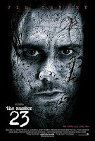
- The title of the film 'Out of Focus' links to part of the film's plot, this is common of thrillers for example The Number 23, the title has significance to the film's story. In our thriller the 'Out of Focus' refers to out of focus pictures that the killer would leave at the scenes of crime as their mark to the police and a link to their methods of murder.
Our Opening Sequence challenges the codes of conventions of actual openings and Thrillers by:
- The use of teenage characters- this would not be the case in actual films as more mature characters would be used as it would be more realisitic and would allow the exploration of a more diverse range of emotions, personalities and themes. However we chose to star in the opening ourselves rather than cast adults due to our acting experience. Although adults make it seem more realisitic, we preferred to not have to waste time being unhappy with the acting. Young characters have a purpose in the story and if the film were real it would go on to feature adult characters.
- By not introducing a protagonist- the characters are victims of the killer, the protagonist would be a detective trying to stop the killer however they are not seen in the opening. This is another trait taken from Seven which is an existing opening that does not introduce a protagonist.
- Not revealing the identity of the villain- Thrillers are about stopping a villain rather than uncovering who they are like in a murder mystery. Although it could be argued we challenge this convention by hiding the killer's identity this was done intentionally in the opening to create suspense and intrigue, if it were a full film we would go on to reveal their identity.
Overall, the opening does conform to the codes and conventions well and the style is an accurate take on the Thriller.
Friday, 16 April 2010
Re- Filming of Photo Pan (12th April)
This time we placed a black cloth from the drama department underneath the pin board so we could place other photos around it and was a better effect than carpet. Me and Sophie took it turns to film the pan sequence trying to keep our hands steady and taking several breaks, we filmed for a long time so we could select the best parts later. We also shut the blinds in the room, turned the light off and used a film light to create a dull lighting scehem and dark shadow effect on the images, creating a sinister mood and atmosphere. This was something we wanted to do when filmed the scene originally but did not have the equipment or conditions to do so, so I was glad to be able to do it now. Andrew kept making the light flicker during the pan to create tension and give the effect that a candle in the room was blowing and flickering.
Friday, 26 March 2010
Re- Edit (22nd/ 26th March)
http://freeplaymusic.com/
He carried out his search on the website above and gained 5 possible tracks to use, he saved them on to our shared (T) Drive so that we could access them whilst editing the footage in Adobe Premier on a separate computer. Below are the titles of the tracks:
•Figures Taking Shape
•Freeze In Place
•Secrets Told
•The Dark Side
•Victim Pileup
Next week we need to re-film the photo pan sequence in widescreen. Hopefully having this second chance at filming will allow us to improve the footage from the first time.
Tuesday, 23 March 2010
Feedback on First Draft (22nd March)
•Unusual approach
•Good camera work
•Good music choices - tension built at points
•Out of focus shot at the end - good ending
•Music - at points makes it sound like Television Drama
•Re-film shots in wide screen (that weren't)
•Length of shots need to be edited and cut down
•"Tom" and "Sophie" romantic section, looks too "happy" and focused around them
•Cuts more from "stalkers" point of view so that it build up tension
We got to work on adapting our opening ready for the final edit.
Friday, 19 March 2010
Editing- Part Three and Completed Draft (19th March)
- The section of the couple is too long and not tense enough and needs to be cut down and have some more shots from the killers point of view. Some other music which is more tense could be used here too.
- We need to re-film the photo pan in widescreen. These parts need to be longer.
- We need to re-film the end of the victim Andrew plays section in widescreen and include it.
- We need to record some voiceovers and other sound effects to create a more of a montage feel.
Tuesday, 16 March 2010
Editing- Part Two (15th March)
We then placed the third and final part of the photo pan after this section which then fades into a close up of the couple hugging against a fence. We edited this so the camera cuts between both sides of the couple first seeing the boy's face and the back of the girl and then vice versa before cutting to a long shot from the viewpoint of the killer as the girl starts to notice something. We then placed the shot of where the camera drops and you see the killer run towards the couple. As a group we decided this would be a good place to end the opening as it leaves it on a cliffhanger and the audience would not know exactly what happened, only assume. Although we really liked the footage we shot in the trees as the couple are chased as it was a good location, had some good shot types and was fast paced we felt it was not needed and took away from the intrigue and suspense. We believed the shot as the camera drops was an ideal ending so we placed a fade out to black at the end.
Next we added the music which we found in our first planning lessons and it really suits the piece well enhancing what is seen on screen creating a sinister mood, injecting the audience with the feeling of something is going to happen. Overall, another successful lesson, on Friday we will add the titles to our Opening and look through it to edit any other parts ready to upload the first draft to Youtube and then our blogs. We also need to decide on a name. In the editing section of the project the group has worked well, alternating between doing extra research and helping whoever is on the editing computer, which although mainly is Josh the rest of the group is always telling him ideas of what to edit, cut, insert or change, he is just elected to carry the action out as only one can be round the computer.
Sunday, 14 March 2010
Editing- Part One (12th March)
We had filmed several versions of the same scene to ensure that if any mistakes were made we had a different version to use and did not have to go out at the last minute to re-film. Because of this, as we looked through the clips we discussed which were the versions of the scenes we would use as some were better than others. For example the shot where the killer drops the camera was filmed several times and initially we had opted for the version where the camera cuts very briefly to footage previously recorded on the tape as the effect suited the action however we found when we watched the shot on the computer that it froze instead. Therefore we now had to use the first version we took, although this is not perfect I suggested we could cut a small section out where Andrew's hands come into the shot and speed it up- giving the effect of falling. Below is the computer we edited on using Adobe Premier Pro:

We also decided that the handheld camera filming of the photos was superior to the version we filmed on the tri-pod, which was rigid, inconsistent and not as smooth. Although the handheld footage could be shaky at times we watched all of the footage we filmed and cut out the excess footage that was not needed or was not good enough. We then edited the best quality footage into three seperate parts. We judged the quality on how still the camera was and if a consistent slow- medium speed pan over the photos was sustained. We will place these three different parts of the photo pan sequence in between the scenes of our victims later in the editing process. We added a spotlight effect to highlight what was in the centre of the screen and create the effect of camera lens, fitting in with the narrative of taking photos. The idea is that the opening will keep cutting back and forth between the panning of the photos and clips of the victims.
Next, we started editing the section of Victim One- played by Andrew walking and being followed. We filmed Andrew walking down the street from a side viewpoint from the other side of the road, in front of him as he walked towards the camera and behind him as he walked away. We placed these three clips together on the timeline starting with the side viewpoint before cutting to the front view and then the rear view. We spent a lot of time cutting little sections away so they matched with each other, meaning the continuty was met. For example at the end of sideview shot Andrew walks past the end of a wall and as the camera then cuts to the front view he needs to be in the same position so we cut the clip so it started with Andrew next to the wall meaning it follwed on accurately. This can take time and you have to be very specific however it is rewarding when you get the shots to match and the transition perfect and it looks effective having different shots and angles in a scene and is a techinque actual films use.
We decided to have our opening in black and white as this symbolises flashbacks or prologues and fits the mood of the piece. Initially we only had the photo pan section in black and white however the transition from black and white to colour for the other scenes was an obvious contrasting change and did not work. We then tried putting everything we had done so far colour and edited the saturation and colour but it made the footage look unclear and a slight cartoon feel. We all preferred black and white as it fitted the style of a Thriller by creating a dark tense mood.
So far we have the first part of the photo pan at the start and then the camera cuts to the scene of Victim one. In between the twos scenes we placed a fade effect at the end so the scene faded smoothly into the first shot of Andrew walking. We tried several transition effects including dissolve and wipe however some were not smooth enough and some made too much happen, whereas we wanted the transition between the two to be as subtle as possible. We even tried leaving the transition without an effect however it was too sudden. Unfortunately we ended a successful editing lesson badly due to realising that the photo pan footage and the footage of Andrew which we filmed earlier were not in widescreen and so was not in the required format and meant that the screen was smaller than the rest of the footage. We do not have time to re-film anything now so we will use the footage for the draft and re-film anything we need in widescreen for the final edit. We perhaps forgot to check the format on those occasions due to problems with night mode and the rain.
Final Filming (12th March)

Here is a location shot of the alley- (which is dull and dank, a place which is somewhere you believe someone could be abducted)

Monday, 8 March 2010
Filming- Part Three (8th March)


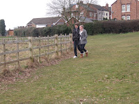



We then filmed an idea me and Sophie had in the planning stage- a shot where the camera is on the victims- the couple, from the perspective of the killer watching them- as if it was his camera filming them. Andrew filmed this shot and moved behind a tree create the effect of the killer moving to avoid being seen as Sophie starts to starts to notice something in the bushes behind her whilst she is hugging me. Then when he has been spotted he drops the camera and runs towards them. This will be cut with the close ups and shots we filmed earlier. This is an effective and skillful shot that creates a sinister effect however it was difficult to film as we had to make it look like the camera had actually been dropped by the killer without actually dropping it because the fall would damage it. It needed to fall in a way that looked realistic and land on an angle. I told Andrew to shake the camera fast and jerky while bringing it down to the ground and drop it when it is just centimetres away from the floor over one of the tree trunks. Therefore it could land on an angle and the shaking makes it hard to see what is happening- giving the effect that it had fallen. We filmed this three times so we could choose the best one. In one of the takes when the camera was dropped the footage actually went fuzzy and cut to the footage we were recording over for a second. This was an effect we created by mistake and actually looked effective as it was so quick you could not actually see what was on screen and it could have been what the killer previously had recorded. We decided to use that version of the shot.

The image above shows the location Me and Sophie found behind the field and thought it would be an excellent place to film like a chase or running sequence as the couple try to escape from the killer after he dropped the camera and ran after them. We took several shots of Me and Sophie running from out of the bushes and looking frantically where to go before running past the camera. This was done with a long shot so you could see all of our bodies and the surroundings and a pan was used to follow us as we ran- the pan gave a sense of being trapped and the effect of the characters having to keep moving. Andrew then filmed an extreme close up of the lower part of Josh's body as the the stalker walked slowly hunting his prey. This would contrast with the fast moving of the victims and would create tension as the predator hunted it's prey while his identity remains hidden. Overall, a great lesson where we filmed some great footage with a variety of shot types and in a well chosen location. The group has a better idea of where our Opening is going now as our ideas are more focused. We aim to finish filming in our free period before the lesson on Friday where will film the end of the other victims' (Andrew) story which we started last Friday.
Friday, 5 March 2010
Filming- Part Two (5th March)


We then went to a playground to film me as a different victim sitting on a swing waiting for someone. We chose a playground as it would add a sinister feel to sequence where children can be took anywhere and there not safe on a place specifically for them. Josh and Andrew filmed this scene, which consisted of me walking into the park, going to the swing, and sit waiting gently swinging whilst the killer would be watching. Again we filmed the scene with different shot types to make it more interesting and show we have a skill and an understanding of different shots/ angles and their purposes as well as the thought that has gone into making our opening. The shots were a close up, a mid-shot where the camera was placed directly in front of me, a mid- shot where the camera was placed next to swing and looked on at me from just off the side (diagonally). I also suggested we take a shot from on top of the slide to get a high angle shot which would represent my vulnerability. After this we filmed the scene from the POV of the killer again to show he is watching (this was done better this time and hide parts of trees and bushes in the way to show he is hiding).
Here are the location shots/stills of where we filmed this scene-


